NSPanel Lovelance UI
This is a custom UI for the NSPanel, with HomeAssistant Lovelance UI Design. The general idea is that the Nextion Display cycles though a page counter and the esp32 tells the display what to do. If you are changeing the page the nextion display will send and event to the esp32 and it has to answer with the messages, that will update the current page with it's desired components. This enables easy changes, without touching the HMI Project.
Current State
It's currently possible to set the content of the pages through homeassistant/nodered. (Shutter and Lights supported) And the detail page for lights is working.
Halfway done upcoming pages :)
Yes, I implemented a circle drawing algorithim for this in nextion ...

Tasmota
Use autoexec.be from tasmota folder like you would use with the stock tft file.
Driver behaves similar to the stock implementation, messages are published over mqtt.
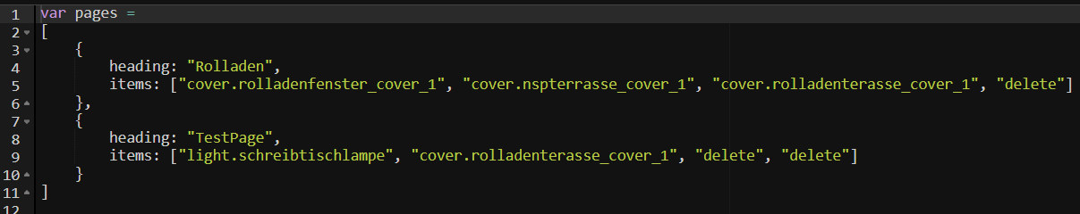
See nodered example flow for my implementation. Pages on nspanel are generated from the array at the begin of the pages function in the flow:
EspHome component
See Readme in esphome folder.
NsPanel Custom UI
This is a replacement for the stock ui on nspanel, it can be controlled via custom serial command, like the stock one (but with different commands). This enables a user experiance, where it's possible to use nspanel with custom UI, but without messing around with Nextion Editor, because it's possible to configure widgets.
Custom Protocol
55 BB [payload length] [payload] [crc] [crc]
Payload length contains the number of bytes of the payload.
CRC is "CRC-16 (MODBUS) Big Endian" calculated over the whole message
This protocol does not try to implement broken JSON Commands with a specified type (lol). Instead the commands are plain text commands with parameters.
Example for valid Message
This message has to be generated for the Message "1337" (1337 is not a valid command, this is just an example)
55 BB 04 31 33 33 37 5F 5B
Messages to Nextion Display
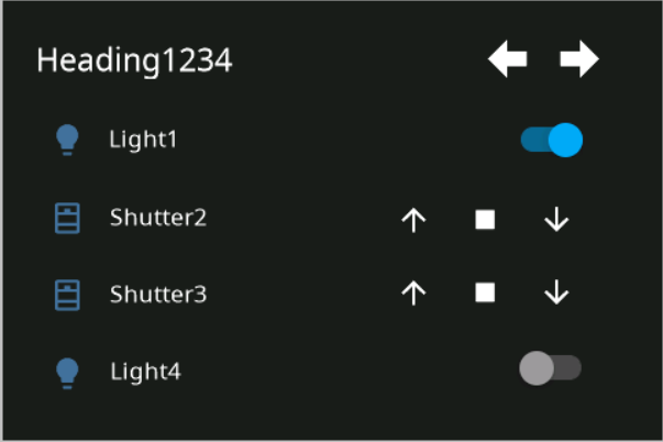
cardEntities Page
The following message can be used to update the content on the cardEntities Page
entityUpdHeading,heading1337
entityUpd,id,iconId,nameOfEntity,type,optionalValue
entityUpd,1,1,Light1,light,0
entityUpd,2,0,Shutter2,shutter
entityUpd,3,0,dc,delete
Messages from Nextion Display
cardEntities Page
event,eventName,PageNumber,PageHeading,entityName,buttonId,actionName,optionalValue
event,pageOpen,0
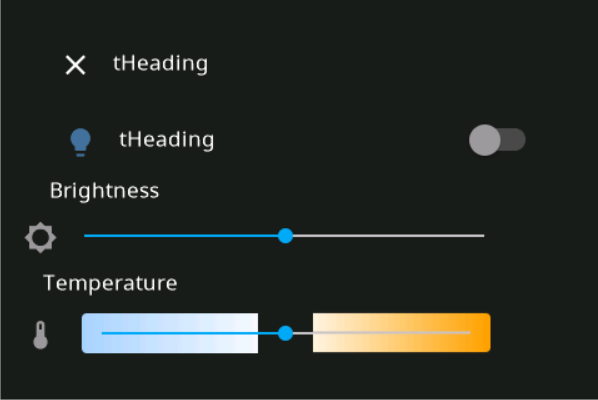
event,buttonPress,1,tHeading,tEntityName,1,up
event,buttonPress,1,tHeading,tEntityName,1,down
event,buttonPress,1,tHeading,tEntityName,1,stop
event,buttonPress,1,tHeading,tEntityName,1,OnOff,1
Design Guidelines for Nextion HMI Project
Background Color is
- RGB565: 6371 [18e3] (HEX: #1C1C1C, RGB: 28,28,28)
Source for Icons is the Material Design Font, used by HASPone https://github.com/HASwitchPlate/HASPone